2 CSS
2.1 CSS第一步
2.1.1 CSS概述
2.1.2 什么是CSS
CSS(层叠样式表)是用来指定文档如何展示给用户的一门语言,如网页的样式、布局、等等。
CSS可以用于给文档添加样式,比如改变标题和链接的颜色及大小。它也可以用于创建布局,比如将一个单列文本变成包含主要内容区域和存放相关信息的侧边栏区域的布局。他甚至还可以用来做一些特效,比如动画。
2.1.3 CSS入门
index.html
 1
 2
 3
 4
 5
 6
 7
 8
 9
10
11
12
13
14
15
16
17
18
|
<!doctype html>
<html lang="en">
<head>
    <meta charset="utf-8">
    <title>开始学习CSS</title>
    <link rel="stylesheet" href="styles.css">
</head>
<body>
    <h1>我是一级标题</h1>
    <p class="special">这是一个段落文本. 在文本中有一个 <span class="special">span element</span>并且还有一个 <a href="http://example.com">链接</a>.</p>
    <p>这是第二段. 包含了一个 <em>强调</em> 元素.</p>
    <ul>
        <li>项目1</li>
        <li class="special">项目2</li>
        <li>项目 <em>三</em>hello</li>
    </ul>
</body>
</html>
|
styles.css
 1
 2
 3
 4
 5
 6
 7
 8
 9
10
11
12
13
14
15
16
17
18
19
20
21
22
23
24
25
26
27
28
29
30
31
32
33
34
35
36
37
38
39
40
41
42
43
|
h1 {
    color: red;
}

p {
    color:green;
}

li {
    color:green;
    list-style-type: style;
}

li.special,
span.special {
    color: orange;
    font-weight: bold;
}


li em{
    color: rebeccapurple;
}

h1 + p{
    font-size: 200%;
}

a:link{
    color:pink;
}
a.visited{
    color:green;
}
a.hover{
    text-decoration: none;
}

body h1+p.special{
    color:yellow;
    background-color:black;
    padding:5px;
}
|
2.1.4 如何构建
index.html
 1
 2
 3
 4
 5
 6
 7
 8
 9
10
11
12
|
<!DOCTYPE html>
<html>
  <head>
    <meta charset="utf-8">
    <title>My CSS experiment</title>
    <link rel="stylesheet" href="styles.css">
  </head>
  <body>
    <h1>Hello World!</h1>
    <p>This is my first CSS example</p>
  </body>
</html>
|
styles.css
1
2
3
4
5
6
7
8
9
|
h1 {
  color: blue;
  background-color: yellow;
  border: 1px solid black;
}

p {
  color: red;
}
|
index.html
 1
 2
 3
 4
 5
 6
 7
 8
 9
10
11
12
13
14
15
16
17
18
19
20
21
22
|
<!DOCTYPE html>
<html>
  <head>
    <meta charset="utf-8">
    <title>My CSS experiment</title>
    <style>
      h1 {
        color: blue;
        background-color: yellow;
        border: 1px solid black;
      }

      p {
        color: red;
      }
    </style>
  </head>
  <body>
    <h1>Hello World!</h1>
    <p>This is my first CSS example</p>
  </body>
</html>
|
index.html
 1
 2
 3
 4
 5
 6
 7
 8
 9
10
11
|
<!DOCTYPE html>
<html>
  <head>
    <meta charset="utf-8">
    <title>My CSS experiment</title>
  </head>
  <body>
    <h1 style="color: blue;background-color: yellow;border: 1px solid black;">Hello World!</h1>
    <p style="color:red;">This is my first CSS example</p>
  </body>
</html>
|
2.1.5 如何运行
当浏览器展示一个文件的时候,处理文件的基本流程。
- 浏览器载入HTML
- 浏览器把HTML转化成DOM(Document Object Model)
- 浏览器拉取HTML相关资源,比如图片、CSS样式、视频。
- 浏览器拉取到CSS后会进行解析,根据不同的类型(element、class、id等)把他们分到不同的桶中。
浏览器找到不同的选择器,将不同的规则应用在对应的DOM节点,并添加节点依赖的样式(这个中间步骤称为渲染树)。
- 渲染树会依照该出现的结构进行布局。
- 网页展示在屏幕上(这一步被称为着色)。
2.2 CSS构建基础
2.2.1 CCS构建基础概览
2.2.2 层叠与继承
-
冲突规则
- 元素选择器按顺序总是最后的规则生效
- 类选择器优先级高于元素选择器
-
理解继承
-
理解层叠
- 资源顺序(相同权重的多个规则,后面的规则覆盖前面的规则)
- 优先级从高到低
- 声明在style的属性(内联样式)
- ID选择器
- 类选择器
- 元素选择器
- 重要程度(!improtant能够覆盖所有优先级的计算)
-
CSS位置的影响
 1
 2
 3
 4
 5
 6
 7
 8
 9
10
11
12
13
14
15
16
17
18
19
20
21
22
23
24
25
26
27
28
29
30
31
32
33
34
35
36
37
38
39
40
41
42
43
44
45
46
47
48
49
50
51
52
53
54
55
56
57
58
59
60
61
62
63
64
65
66
67
68
69
70
71
72
73
74
75
76
|
<!DOCTYPE html>
<html lang="en">
<head>
    <meta charset="UTF-8">
    <meta http-equiv="X-UA-Compatible" content="IE=edge">
    <meta name="viewport" content="width=device-width, initial-scale=1.0">
    <title>Document</title>
    <link rel="stylesheet" href="styles.css">
</head>
<body>
    <!-- 冲突规则 -->
    <h1 class="main-heading">CSS 冲突规则</h1>

    <!-- 继承 -->
    <p>hello <span>world!</span></p>

    <!-- 理解继承 -->
    <ul class="main">
        <li>item One</li>
        <li>item Two
            <ul>
                <li>2.1</li>
                <li>2.2</li>
            </ul>
        </li>
        <li>item Three
            <ul class="special">
                <li>3.1
                    <ul>
                        <li>3.1.1</li>
                        <li>3.1.2</li>
                    </ul>
                </li>
                <li>3.2</li>
            </ul>
        </li>
    </ul>

    <!-- 控制继承 -->
    <ul class="my-class">
        <li>Default <a href="http://example.com">link</a> color</li>
        <li class="my-class-1">inherit the <a href="http://example.com">link</a> color</li>
        <li class="my-class-2">Reset the <a href="http://example.com">link</a> color</li>
        <li class="my-class-3">Unset the <a href="http://example.com">link</a> color</li>
    </ul>

    <!-- 重设所有值 -->
    <blockquote><p>This blockquote is styled</p></blockquote>
    <blockquote class="fix-this"><p>This blockquote is styled</p></blockquote>

    <!-- 理解层叠 -->
    <div id="outer" class="container">
        <div id="inner" class="container">
            <ul>
                <li class="nav"><a href="#">One</a></li>
                <li class="nav"><a href="#">Two</a></li>
            </ul>
        </div>
    </div>

    <!-- 重要性
     -->
    <p class="better">This is a paragraph.</p>
    <p class="better" id="winning">One selector to rule them all!</p>

    <!-- 主动学习 -->
    <div id="outer2" class="container">
        <div id="inner2" class="container">
          <ul>
            <li class="nav2"><a href="#">One</a></li>
            <li class="nav2"><a href="#">Two</a></li>
          </ul>
        </div>
      </div>
</body>
</html>
|
  1
  2
  3
  4
  5
  6
  7
  8
  9
 10
 11
 12
 13
 14
 15
 16
 17
 18
 19
 20
 21
 22
 23
 24
 25
 26
 27
 28
 29
 30
 31
 32
 33
 34
 35
 36
 37
 38
 39
 40
 41
 42
 43
 44
 45
 46
 47
 48
 49
 50
 51
 52
 53
 54
 55
 56
 57
 58
 59
 60
 61
 62
 63
 64
 65
 66
 67
 68
 69
 70
 71
 72
 73
 74
 75
 76
 77
 78
 79
 80
 81
 82
 83
 84
 85
 86
 87
 88
 89
 90
 91
 92
 93
 94
 95
 96
 97
 98
 99
100
101
102
103
104
105
106
107
108
109
110
|
h1.main-heading{
    color:chartreuse;
}
h1 {
    color:red;
}
h1 {
    color:blue;
}

p{
    color:blue;
}
span{
    color: blueviolet;
}

.main {
    color: rebeccapurple;
    border: 2px solid #ccc;
    padding: 1em;
}
.special{
    color:black;
    font-weight: bold;
}

.my-class{
    color:green;
}
.my-class-1{
    color:inherit;
}
.my-class-2{
    color:initial;
}
.my-class-3{
    color:unset;
}
/* a {
    color:red;
} */

blockquote{
    background-color: red;
    border: 2px solid green;
}
.fix-this{
    all: unset;
}

#outer a {
    background-color: red;
}
#outer #inner a {
    background-color: blue;
}
#outer div ul li a {
    color: yellow;
}
#outer div ul .nav a {
    color: white;
}
div div li:nth-child(2) a:hover {
    border:10px solid black;
}
div li:nth-child(2) a:hover {
    border: 10px dashed black;
}
div div .nav:nth-child(2) a:hover {
    border: 10px double black;
}
a {
    display: inline-block;
    line-height: 40px;
    font-size: 20px;
    text-decoration: none;
    text-align: center;
    width: 200px;
    margin-bottom: 10px;
}
ul {
    padding: 0;
}
li {
    list-style-type: none;
}


#winning {
    background-color: red;
    border: 1px solid black;
    color: white;
    padding: 5px;
}

.better {
    background-color: gray;
    border: none !important;
    color: white;
    padding: 5px;
}

#inner2 .nav2 a {
    color: yellow;
    background-color: blue;
    padding: 5px;
    display: inline-block;
    margin-bottom: 10px;
  }
|
2.2.3 CSS选择器
-
类型、类和ID选择器
- 类型选择器也叫“标签名选择器”或者是“元素选择器”,因为它在文档中选择了一个HTML标签/元素。
- 全局选择器由一个星号(*)代指,他选中了文档中的所有内容。
- 类选择器以一个句点(.)开头,会选择文档中应用了这个类的所有物件。
- 指定向特定元素的类。
- 多个类被应用的时候指向一个元素。
- ID选择器由#开头,用法类似类选择器。
-
属性选择器(选定带有特定属性的元素)
- 存否和值选择器。
- 子字符串匹配选择器。
- 大小写敏感。
-
伪类和伪元素
- 伪类是添加到选择器的关键字,指定要选择元素的特殊状态。
- :first-child
- :last-child
- :only-child
- :invalid
- 用户行为伪类
- :focus(用户使用键盘选定元素时激活)
- :hover(用户将移指针到元素上的时候才会激活)
- 伪元素是一个附加至选择器末的关键字,允许你对元素的特定部分修改样式。
- ::first-line
- ::before
- ::after
-
关系选择器
- 后代选择器(“空格”)
- 子代关系选择器(“>”只作用一代更远的后代不会生效)
- 邻接兄弟选择器(+)
- 通用兄弟选择器(~)
-
selector test 1
 1
 2
 3
 4
 5
 6
 7
 8
 9
10
11
12
13
14
15
16
17
18
19
20
21
22
23
24
25
26
27
28
29
30
31
32
33
34
35
36
|
<!DOCTYPE html>
<html lang="en">
<head>
    <meta charset="UTF-8">
    <meta http-equiv="X-UA-Compatible" content="IE=edge">
    <meta name="viewport" content="width=`, initial-scale=1.0">
    <title>2.2 selector test 1</title>
    <style>
/*
    使一级标题的字体颜色为蓝色
    使二级标题有一个蓝色背景且白色文本。
    使跨距中换行的文本的字体大小为200%。 */

        .container h1 {
            color: blue;
        }

        .container h2 {
            color: white;
            background-color: blue;
        }

        .container span {
            font-size: 200%;
        }
    </style>
</head>
<body>
    <div class="container">
        <h1>This is a heading</h1>
        <p>Veggies es <span>bonus vobis</span>, proinde vos postulo essum magis kohlrabi welsh onion daikon amaranth tatsoi tomatillo melon azuki bean garlic.</p>
        <h2>A level 2 heading</h2>
        <p>Gumbo beet greens corn soko endive gumbo gourd. Parsley shallot courgette tatsoi pea sprouts fava bean collard greens dandelion okra wakame tomato. Dandelion cucumber earthnut pea peanut soko zucchini.</p>
      </div>
</body>
</html>
|
 1
 2
 3
 4
 5
 6
 7
 8
 9
10
11
12
13
14
15
16
17
18
19
20
21
22
23
24
25
26
27
28
29
30
31
32
33
34
35
36
37
38
39
40
41
42
43
44
45
46
47
48
|
<!DOCTYPE html>
<html lang="en">

<head>
    <meta charset="UTF-8">
    <meta http-equiv="X-UA-Compatible" content="IE=edge">
    <meta name="viewport" content="width=`, initial-scale=1.0">
    <title>2.2 selector test 2</title>
    <style>
/*
    让id为 special 的元素有一个黄色背景。
    让使用类 alert 的元素有一个 1px 的灰色边框。
    如果一个元素使用了 alert 类还有 stop类, 让它的背景变为红色。
    如果一个元素使用 alert 类还有 go类,让它的背景变为绿色。 */

        #special {
            background-color: yellow;
        }

        .alert {
            border: 1px solid gray;
        }

        .alert.stop {
            background-color: red;
        }

        .alert.go {
            background-color: green;
        }
    </style>
</head>

<body>
    <div class="container">
        <h1>This is a heading</h1>
        <p>Veggies es <span class="alert">bonus vobis</span>, proinde vos postulo <span class="alert stop">essum
                magis</span> kohlrabi welsh onion daikon amaranth tatsoi tomatillo melon azuki bean garlic.</p>
        <h2 id="special">A level 2 heading</h2>
        <p>Gumbo beet greens corn soko endive gumbo gourd.</p>
        <h2>Another level 2 heading</h2>
        <p><span class="alert go">Parsley shallot</span> courgette tatsoi pea sprouts fava bean collard greens dandelion
            okra wakame tomato. Dandelion cucumber earthnut pea peanut soko zucchini.</p>

    </div>
</body>

</html>
|
 1
 2
 3
 4
 5
 6
 7
 8
 9
10
11
12
13
14
15
16
17
18
19
20
21
22
23
24
25
26
27
28
29
30
31
32
33
34
35
36
37
38
39
40
41
42
43
44
45
46
47
48
49
50
51
52
53
54
55
56
57
58
59
60
61
62
63
64
65
66
67
68
69
70
71
72
73
74
75
76
77
78
|
<!DOCTYPE html>
<html lang="en">

<head>
    <meta charset="UTF-8">
    <meta http-equiv="X-UA-Compatible" content="IE=edge">
    <meta name="viewport" content="width=`, initial-scale=1.0">
    <title>2.2 selector test 3</title>
    <style>
/*
    链接文本的样式:使链接为橘色,被访问后变为绿色,当被hover时,移除链接文本的下划线。
    让容器里的第一个元素的字体大小为:150%,并且让这个元素的第一行是红色的。
    让表格中每隔一行条带化,分别给它们一个颜色为#333的背景和一个白色前景。 */

        a {
            color: orange;
        }

        a:visited {
            color: green;
        }

        a:hover {
            text-decoration-line: none;
        }

        .container p:first-child {
            font-size: 150%;
        }

        .container p:first-child::first-line {
            color: red;
        }

        div table tr:nth-of-type(2n) {
            color: white;
            background-color: #333;
        }
    </style>
</head>

<body>
    <div class="container">
        <p>Veggies es <a href="http://example.com">bonus vobis</a>, proinde vos postulo essum magis kohlrabi welsh onion
            daikon amaranth tatsoi tomatillo melon azuki bean garlic.</p>
        <p>Gumbo beet greens corn soko endive gumbo gourd. Parsley shallot courgette tatsoi pea sprouts fava bean
            collard greens dandelion okra wakame tomato. Dandelion cucumber earthnut pea peanut soko zucchini.</p>
        <table>
            <tr>
                <th>Fruits</th>
                <th>Vegetables</th>
            </tr>
            <tr>
                <td>Apple</td>
                <td>Potato</td>
            </tr>
            <tr>
                <td>Orange</td>
                <td>Carrot</td>
            </tr>
            <tr>
                <td>Tomato</td>
                <td>Parsnip</td>
            </tr>
            <tr>
                <td>Kiwi</td>
                <td>Onion</td>
            </tr>
            <tr>
                <td>Banana</td>
                <td>Beet</td>
            </tr>
        </table>
    </div>

</body>

</html>
|
 1
 2
 3
 4
 5
 6
 7
 8
 9
10
11
12
13
14
15
16
17
18
19
20
21
22
23
24
25
26
27
28
29
30
31
32
33
34
35
36
37
38
39
40
41
42
43
44
45
46
47
48
49
50
|
<!DOCTYPE html>
<html lang="en">

<head>
  <meta charset="UTF-8">
  <meta http-equiv="X-UA-Compatible" content="IE=edge">
  <meta name="viewport" content="width=`, initial-scale=1.0">
  <title>2.2 selector test 4</title>
  <style>
    /*
    让任何直接跟随二级标题的段落颜色为红色。
    移除使用了list类的无序列表的儿子元素前面的原点并给他们添加一个1px的灰色下边框。 */

    h2+p {
      color: red;
    }

    .list>li {
      list-style-type: none;
      border-width: 1px;
      border-color: gray;
      border-style: none none solid none;
    }
  </style>
</head>

<body>
  <div class="container">
    <h2>This is a heading</h2>
    <p>This paragraph comes after the heading.</p>
    <p>This is the second paragraph.</p>

    <h2>Another heading</h2>
    <p>This paragraph comes after the heading.</p>

    <ul class="list">
      <li>One</li>
      <li>Two
        <ul>
          <li>2.1</li>
          <li>2.2</li>
        </ul>
      </li>
      <li>Three</li>
    </ul>
  </div>

</body>

</html>
|
 1
 2
 3
 4
 5
 6
 7
 8
 9
10
11
12
13
14
15
16
17
18
19
20
21
22
23
24
25
26
27
28
29
30
31
32
33
34
35
36
37
38
39
40
41
42
43
44
45
|
<!DOCTYPE html>
<html lang="en">

<head>
  <meta charset="UTF-8">
  <meta http-equiv="X-UA-Compatible" content="IE=edge">
  <meta name="viewport" content="width=`, initial-scale=1.0">
  <title>2.2 selector test 5</title>
  <style>
    /*
    Target the <a> element with a title attribute and make the border pink (border-color: pink).
    Target the <a> element with an href attribute that contains the word contact somewhere in its value and make the border orange (border-color: orange).
    Target the <a> element with an href value starting with https and give it a green border (border-color: green). */

    a {
      border: 5px solid grey;
    }

    .test1 {
      border-color: pink;
    }

    .test2 {
      border-color: orange;
    }

    .test3 {
      border-color: green;
    }
  </style>
</head>

<body>
  <div>
    <a class="test1" href="htttp://example.com" title="example.com">example.com</a>
  </div>
  <div>
    <a class="test2" href="mailto:mail@example.com">mail@example.com</a>
  </div>
  <div>
    <a class="test3" href="htttps://example.com">htttps://example.com</a>
  </div>
</body>

</html>
|
2.2.4 盒模型
网页上的区块(block)是指出现在新行上的HTML元素即在该元素的前一个元素的下方,在后一个元素的上方(通常称为块级元素)。
比如HTML中的<p>元素默认是块级元素,而<a>元素是一个内联元素。
display属性可以设置元素的内部和外部显示类型。元素的外部显示类型决定该元素在流式布局中的表现(block or inline);元素的内部显示类型控制子元素的布局。
- 盒模型(box module)
- 块级盒子(block box)
- 内联盒子(inline box)
- 盒子不会产生换行。
- width和height属性无效。
- 垂直方向的内边距、外边距、边框会被应用,不会把其他处于inline状态的盒子推开。
- 水平方向的内边距、外边距、边框会被应用,且会把其他处于inline状态的盒子推开。
- 不同显示类型的例子
 1
 2
 3
 4
 5
 6
 7
 8
 9
10
11
12
13
14
15
16
17
18
19
20
21
22
23
24
25
26
27
28
29
30
31
32
33
34
35
36
37
38
39
40
41
42
43
44
45
|
<!DOCTYPE html>
<html lang="en">

<head>
    <meta charset="UTF-8">
    <meta http-equiv="X-UA-Compatible" content="IE=edge">
    <meta name="viewport" content="width=device-width, initial-scale=1.0">
    <title>Document</title>
    <style>
        /* block */
        p,
        ul {
            border: 2px solid rebeccapurple;
            padding: .5em;
        }

        .block,
        li {
            border: 2px solid blue;
            padding: .5em;
        }

        ul {
            display: flex;
            list-style: none;
        }

        .block {
            display: block;
        }
    </style>
</head>

<body>
    <!-- body -->
    <p>I am a paragraph. A short one.</p>
    <ul>
        <li>Item One</li>
        <li>Item Two</li>
        <li>Item Three</li>
    </ul>
    <p>I am another paragraph. Some of the <span class="block">words</span> have been wrapped in a <span>span element</span>.</p>
</body>

</html>
|
 1
 2
 3
 4
 5
 6
 7
 8
 9
10
11
12
13
14
15
16
17
18
19
20
21
22
23
24
25
26
27
28
29
30
31
32
33
34
35
36
37
38
39
40
41
42
43
44
45
46
|
<!DOCTYPE html>
<html lang="en">

<head>
    <meta charset="UTF-8">
    <meta http-equiv="X-UA-Compatible" content="IE=edge">
    <meta name="viewport" content="width=device-width, initial-scale=1.0">
    <title>Document</title>
    <style>
        /* inline */
        p,
        ul {
            border: 2px solid rebeccapurple;
        }

        span,
        li {
            border: 2px solid blue;
        }

        ul {
            display: inline-flex;
            list-style: none;
            padding: 0;
        }

        .inline {
            display: inline;
        }
    </style>

<body>
    <!-- body -->
    <p>
        I am a paragraph. Some of the <span>words</span> have been wrapped in a <span>span element</span>.
    </p>
    <ul>
        <li>Item One</li>
        <li>Item Two</li>
        <li>Item Three</li>
    </ul>
    <p class="inline">I am a paragraph. A short one.</p>
    <p class="inline">I am another paragraph. Also a short one.</p>
</body>

</html>
|
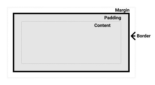
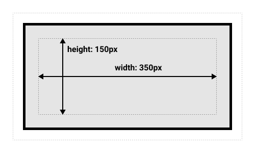
- 盒模型的各个部分
- Content box:这个区域用来显示内容,大小可以通过width和height设置。
- Padding box:包围在内容外和边框内的空白区域;通过padding设置。
- Boarder box:包围内容和内边框的区域;通过border设置。
- Margin box:最外面的区域,是盒子和其他元素之间的空白区域。通过margin设置。
- width: context width.
- height: context height.
- 标准盒模型和替代盒模型
1
2
3
4
5
6
|
html {
  box-sizing: border-box;
}
*, *::before, *::after {
  box-sizing: inherit;
}
|
- 内边距,边框,外边距
- inline-block
- width和height属性生效。
- padding,border,margin会推开其他元素。
 1
 2
 3
 4
 5
 6
 7
 8
 9
10
11
12
13
14
15
16
17
18
19
20
21
22
23
24
25
26
27
28
29
30
31
32
33
34
35
36
37
38
39
40
41
42
43
44
45
46
47
48
49
50
51
52
53
54
55
56
|
<!DOCTYPE html>
<html lang="en">

<head>
    <meta charset="UTF-8">
    <meta http-equiv="X-UA-Compatible" content="IE=edge">
    <meta name="viewport" content="width=device-width, initial-scale=1.0">
    <title>Document</title>
    <style>
        span {
            margin: 20px;
            padding: 20px;
            width: 80px;
            height: 20px;
            background-color: lightblue;
            border: 2px solid blue;
            display: inline-block;
        }

        .links-list {
            display: flex;
            list-style-type: none;
        }

        .links-list a {
            display: inline-block;
            background-color: rgb(179, 57, 81);
            color: #fff;
            text-decoration: none;
            padding: 1em 2em;
            border: 1em solid #fff;
        }

        .links-list a:hover {
            background-color: rgb(66, 28, 40);
            color: #fff;
        }
    </style>

<body>
    <!-- body -->
    <p>
        I am a paragraph and this is a <span>span</span> inside that paragraph. A span is an inline element and so does
        not respect width and height.
    </p>

    <nav>
        <ul class="links-list">
            <li><a href="">Link one</a></li>
            <li><a href="">Link two</a></li>
            <li><a href="">Link three</a></li>
        </ul>
    </nav>
</body>

</html>
|
2.2.5 背景与边框
 1
 2
 3
 4
 5
 6
 7
 8
 9
10
11
12
13
14
15
16
17
18
19
20
21
22
23
24
25
26
27
28
29
30
31
32
33
34
35
36
37
|
<!DOCTYPE html>
<html lang="en">

<head>
    <meta charset="UTF-8">
    <meta http-equiv="X-UA-Compatible" content="IE=edge">
    <meta name="viewport" content="width=device-width, initial-scale=1.0">
    <title>Document</title>
    <style>
        /*
    给方框一个5px的黑色实心边框,圆角为10px。
    添加一个背景图像(使用URL balloons.jpg),并调整它的大小,使它能够覆盖盒子。
    给<h2>一个半透明的黑色背景颜色,并使文本为白色。 */

        .box {
            border: 5px solid black;
            border-radius: 10px;
            background-image: url(https://mdn.github.io/css-examples/learn/backgrounds-borders/balloons.jpg);
            background-size: contain;
            /* background-repeat: no-repeat; */
        }

        h2 {
            /* background-color: black; */
            background-image: linear-gradient(90deg, red, blue);
            color: white;
        }
    </style>

<body>
    <!-- body -->
    <div class="box">
        <h2>Backgrounds & Borders</h2>
    </div>
</body>

</html>
|
2.2.6 处理不同的文本方向
-
书写模式是指文本的排列方向是横向还是纵向。
- writing-mode
- horizontal-tb(从上至下)
- vertical-rl(从右向左)
- vertical-lr(从左向右)
-
块级布局和内联布局


-
逻辑属性和逻辑值
-
逻辑内边距、边框和外边框属性
2.2.7 溢出的内容
- overflow
- overflow:visible
- overflow:hidden
- overflow:scroll
2.2.8 值和单位
https://developer.mozilla.org/en-US/docs/Web/CSS/CSS_Values_and_Units
2.2.9 在CSS中调整大小
https://developer.mozilla.org/zh-CN/docs/Learn/CSS/Building_blocks/Sizing_items_in_CSS
2.2.10 图片媒体和表单元素
https://developer.mozilla.org/zh-CN/docs/Learn/CSS/Building_blocks/Images_media_form_elements
2.2.11 样式化表格
2.2.12 调试CSS
2.2.13 组织CSS
2.3 样式化文本
2.3.1 样式化文字概述
2.3.2 基础文字与样式
- 用于样式文本的CSS属性分类:
- 字体属性
- 文本布局
- 其他有用的一些属性
2.3.3 样式化列表
2.3.4 样式化链接
2.3.4 web字体
2.4 CSS layout
2.4.1 layout概述
2.4.2 layout简介
2.4.3 Normal flow
取得元素的内容来放在一个独立的元素盒子中,然后在其周边加上内边距、边框和外边距。就是之前练习过的盒子模型。
块级元素的内容宽度是其父元素的100%,其高度与其内容高度一致。
内联元素的高度和宽度与内容一致。内联元素的高宽无法设置,如果想要控制内联元素的尺寸,需要为元素设置display:block(或display:inline-block)。
正常布局流是一套在浏览器视口内放置、组织元素的系统。默认的,块级元素按照基于父元素的书写顺序的块流动方向放置,每一个块元素会在上一个元素下面另起一行,他们会被设置好margin分割。内联元素则不会另起一行,只要在其父级块级元素的宽度内有足够的空间,它们与其他内联元素、相邻的文本内容被安排在同一行。如果空间不够,溢出的元素将移到新的一行。
 1
 2
 3
 4
 5
 6
 7
 8
 9
10
11
12
13
14
15
16
17
18
19
20
21
22
23
24
25
26
27
28
29
30
31
32
33
34
35
36
37
38
39
40
41
42
43
44
45
46
47
|
<!DOCTYPE html>
<html lang="en">

<head>
    <meta charset="UTF-8">
    <meta http-equiv="X-UA-Compatible" content="IE=edge">
    <meta name="viewport" content="width=device-width, initial-scale=1.0">
    <title>Document</title>
    <style>
        body {
            width: 500px;
            margin: 0 auto;
        }

        p {
            background: rgba(255, 84, 104, 0.3);
            border: 2px solid rgb(255, 84, 104);
            padding: 10px;
            margin: 10px;
        }

        span {
            background: white;
            border: 1px solid black;
        }
    </style>

<body>
    <!-- body -->
    <h1>Basic document flow</h1>

    <p>I am a basic block level element. My adjacent block level elements sit on new lines below me.</p>

    <p>By default we span 100% of the width of our parent element, and we are as tall as our child content. Our total
        width and height is our content + padding + border width/height.</p>

    <p>We are separated by our margins. Because of margin collapsing, we are separated by the width of one of our
        margins, not both.</p>

    <p>inline elements <span>like this one</span> and <span>this one</span> sit on the same line as one another, and
        adjacent text nodes, if there is space on the same line. Overflowing inline elements will <span>wrap onto a new
            line if possible (like this one containing text)</span>, or just go on to a new line if not, much like this
        image will do: <img src="https://mdn.mozillademos.org/files/13360/long.jpg"></p>

</body>

</html>
|
2.4.4 Flexbox
https://wiki.developer.mozilla.org/en-US/docs/Web/CSS/CSS_Flexible_Box_Layout
- flex模型
- 主轴(main axis, main start, main end)
- 交叉轴(cross axis, cross start, cross end)
- flex容器(flex container)
- flex项(flex item)

- flex-direction属性指定主轴(main axis)方向默认row
- row(default)
- row-reverse
- column
- column-reverse
- fles-wrap指定flex元素单行显示还是多行显示。如果允许换行,这个属性允许你控制行的堆叠方向。
- nowrap(default)元素摆放到一行
- wrap元素被打断到多个行
- wrap-reverse
- flex-flow是flex-direction和flex-wrap的缩写。
1
2
|
flex-direction: row;
flex-wrap: wrap;
|
-
flex是一个可以指定最多三个不同值的缩写属性用来指定flex项的尺寸。
-
align-items控制flex项在交叉轴上的位置。
- stretch
- center
- flex-start
- flex-end
-
justify-content控制flex项在主轴上的位置。
- flex-start
- flex-end
- center
- space-around
- space-between
-
order
- 所有flex项默认order值是0
- order值大的flex项比order值小的在显示顺序中更靠后。
- 相同order值的flex项按源顺序显示。
 1
 2
 3
 4
 5
 6
 7
 8
 9
10
11
12
13
14
15
16
17
18
19
20
21
22
23
24
25
26
27
28
29
30
31
32
33
34
35
36
37
38
39
40
41
42
43
44
45
46
47
48
49
50
51
52
53
54
55
56
57
58
59
60
61
62
63
64
65
66
67
68
69
70
71
72
73
74
75
76
77
78
79
80
81
82
|
<!DOCTYPE html>
<html>

<head>
    <meta charset="utf-8">
    <title>Flexbox 0 — starting code</title>
    <style>
        html {
            font-family: sans-serif;
        }

        body {
            margin: 0;
        }

        header {
            background: purple;
            height: 100px;
        }

        h1 {
            text-align: center;
            color: white;
            line-height: 100px;
            margin: 0;
        }

        section {
            display: flex;
            flex-direction: row-reverse;
        }

        article {
            padding: 10px;
            margin: 10px;
            background: aqua;
        }
    </style>

</head>

<body>
    <header>
        <h1>Sample flexbox example</h1>
    </header>

    <section>
        <article>
            <h2>First article</h2>

            <p>Tacos actually microdosing, pour-over semiotics banjo chicharrones retro fanny pack portland everyday
                carry vinyl typewriter. Tacos PBR&B pork belly, everyday carry ennui pickled sriracha normcore hashtag
                polaroid single-origin coffee cold-pressed. PBR&B tattooed trust fund twee, leggings salvia iPhone photo
                booth health goth gastropub hammock.</p>
        </article>

        <article>
            <h2>Second article</h2>

            <p>Tacos actually microdosing, pour-over semiotics banjo chicharrones retro fanny pack portland everyday
                carry vinyl typewriter. Tacos PBR&B pork belly, everyday carry ennui pickled sriracha normcore hashtag
                polaroid single-origin coffee cold-pressed. PBR&B tattooed trust fund twee, leggings salvia iPhone photo
                booth health goth gastropub hammock.</p>
        </article>

        <article>
            <h2>Third article</h2>

            <p>Tacos actually microdosing, pour-over semiotics banjo chicharrones retro fanny pack portland everyday
                carry vinyl typewriter. Tacos PBR&B pork belly, everyday carry ennui pickled sriracha normcore hashtag
                polaroid single-origin coffee cold-pressed. PBR&B tattooed trust fund twee, leggings salvia iPhone photo
                booth health goth gastropub hammock.</p>

            <p>Cray food truck brunch, XOXO +1 keffiyeh pickled chambray waistcoat ennui. Organic small batch paleo
                8-bit. Intelligentsia umami wayfarers pickled, asymmetrical kombucha letterpress kitsch leggings
                cold-pressed squid chartreuse put a bird on it. Listicle pickled man bun cornhole heirloom art party.
            </p>
        </article>
    </section>
</body>

</html>
|
4.4 Grid
https://developer.mozilla.org/zh-CN/docs/Learn/CSS/CSS_layout/Grids
网格是由一系列水平及垂直的线构成的一种布局模式。根据网格,我们能够将设计元素进行排列,帮助我们设计一系列具有固定位置以及宽度的元素的页面,使我们的网站页面更加统一。一个网格通常由列(column)与行(row)组成,列与列、行与行之间的间隙被称为沟槽(gutter)。
4.5 Float
https://developer.mozilla.org/zh-CN/docs/Web/CSS/float
4.6 Position
https://developer.mozilla.org/zh-CN/docs/Web/CSS/position
4.7 Multi column
https://developer.mozilla.org/zh-CN/docs/Web/CSS/CSS_Columns
4.8 响应式布局
https://developer.mozilla.org/zh-CN/docs/Learn/CSS/CSS_layout/Responsive_Design
4.9 媒体查询
https://developer.mozilla.org/zh-CN/docs/Learn/CSS/CSS_layout/Media_queries
4.10 传统布局
https://developer.mozilla.org/zh-CN/docs/Learn/CSS/CSS_layout/Legacy_Layout_Methods
4.11 支持旧浏览器
https://developer.mozilla.org/zh-CN/docs/Learn/CSS/CSS_layout/Supporting_Older_Browsers